import matplotlib.pyplot as plt
import numpy as np

x = np.linspace(0, 10, 100)
y = np.sin(x)

plt.plot(x, y)
plt.show()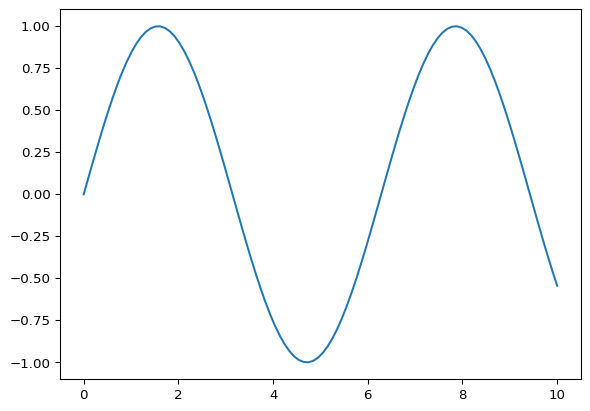
In diesem Kapitel zeigen wir für häufige Problemstellungen jeweils ein schlechtes und ein verbessertes Beispiel.
import matplotlib.pyplot as plt
import numpy as np
x = np.linspace(0, 10, 100)
y = np.sin(x)
plt.plot(x, y)
plt.show()
plt.plot(x, y, label='sin(x)', color='b')
plt.xlabel('Zeit (s)')
plt.ylabel('Amplitude')
plt.title('Sinuskurve')
plt.legend()
plt.show()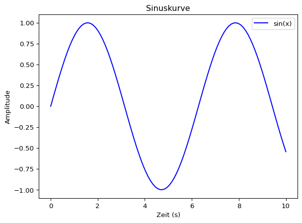
plt.plot(x, y, color='yellow')
plt.show()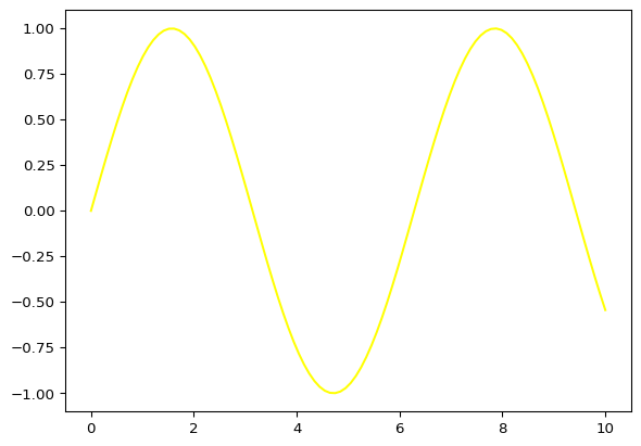
plt.plot(x, y, color='darkblue')
plt.grid(True, linestyle='--', alpha=0.7)
plt.title('Gute Kontraste für bessere Lesbarkeit')
plt.show()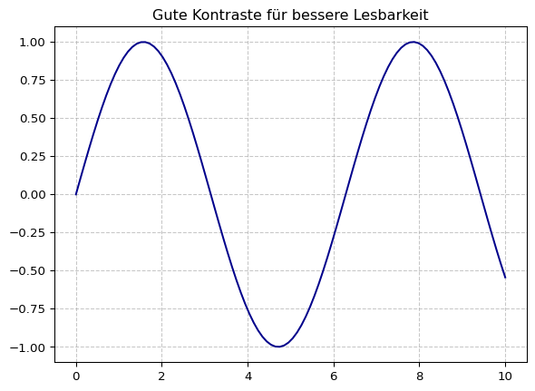
plt.plot(x, y)
plt.ylim(0.5, 1)
plt.show()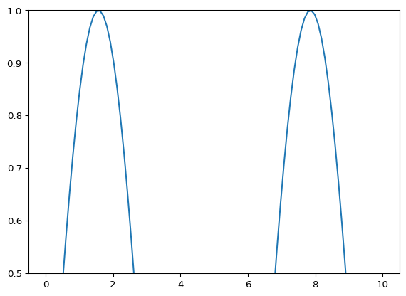
plt.plot(x, y)
plt.ylim(-1.2, 1.2)
plt.xlim(0, 10)
plt.grid(True)
plt.title('Sinnvolle Achsenskalierung')
plt.show()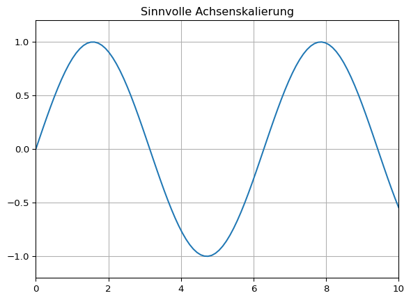
for i in range(10):
    plt.plot(x, np.sin(x + i * 0.2))
plt.show()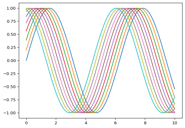
plt.plot(x, np.sin(x), label='sin(x)')
plt.plot(x, np.cos(x), label='cos(x)')
plt.legend()
plt.title('Weniger ist mehr: Reduzierte Informationsdichte')
plt.grid(True)
plt.show()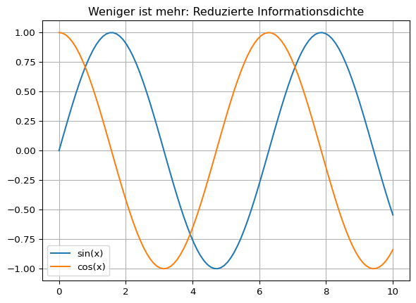
Gute Plots zeichnen sich durch klare Beschriftungen, gute Lesbarkeit und eine sinnvolle Informationsdichte aus.